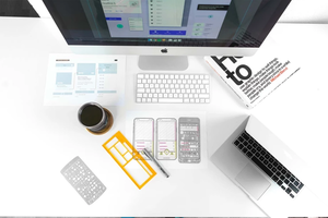
6 Principle Of Effective Interaction Design

More from Ambitious Agency

  • 5 Key Points On Why Branding Is So Important Today
    0 commentaire , 0 comme
  • Brand Tone Of Voice: How To Create Your Brand\u2019s Personality
    0 commentaire , 0 comme
  • Is Facebook In Decline?
    0 commentaire , 0 comme

More in Politics

  • Norton antivirus account login
    31 commentaires, 144 903 vues
  • Liquidity Locking Made Easy
    10 commentaires, 83 134 vues
  • Ang jili178 login ay nagdudulot sa iyo ng mga laro ng slot at karanasan sa laro ng soccer
    2 commentaires, 46 592 vues

Related Blogs

  • KL Escort: Your Gateway to Sensual Bliss
    0 commentaire , 0 comme
  • Lahore Escorts 03265607001 Call Girls in Lahore
    0 commentaire , 0 comme
  • Is Varicose Veins a Hazardous Condition?
    0 commentaire , 0 comme

Les archives

Partage Social

6 Principle Of Effective Interaction Design

Posté par Ambitious Agency     22 juillet 2022    

Corps

You’ve heard of UX Design but how about Interaction Design? Put simply, Interaction Design is concerned with the interaction between users and the product in front of them. While UX deals with a much broader scope of usability — from branding, design to usability and more, Interaction Design starts and ends with the customer using the product.

If you have a website or digital presence, interaction design is crucial to moving your customers along the buying journey. In our latest blog post, we take you through the 6 elements of effective interaction design and how they can help improve sales or leads.

1. FAMILIARITY

It can be tempting to want to build a website that’s entirely different from anything your users have seen before. However, complex or unfamiliar ideas can be frustrating for the end-user and result in higher bounce rates. Good design makes it obvious to the user how to use the product. According to one study, websites have just 50 milliseconds to make a good first impression.

Familiar design minimises how much work the user needs to do to complete a task. Digital Marketing Services NZ interfaces should use familiarity to help users understand how to complete tasks quickly and efficiently.

Affordance

According to Don Norman, UX researcher and author of The Design of Everyday Things, “an affordance is a relationship between the properties of an object and the capabilities of the agent that determine just how the object could possibly be used.”

Just like how on a tap, the handle gives the user a clue as to how to lift it to turn the water on, your website or digital product should give affordance to the user when it comes to buttons and other types of features on your site. For example buttons should look clickable and it should be obvious how interactive tools work.

Popular Interaction Patterns

Rather than reinvent the wheel when designing your website there are some things that should work the same from site to site:

  • Most people will click on a business’s logo to get back to the home page
  • Put contact info at the bottom of the page.
  • Excluding any contact information can lose you sales as it makes your business look less trustworthy.

2. PREDICTABILITY

Like familiarity, effective interaction design is predictable and sets an expectation for what will happen before the user takes an action. Two ways businesses can include interaction design in their website is using clear language and predictable orders for doing things.

Clear Language

The language your website uses should match an action with the intention. This ‘predictability’ can even be taken into your digital ads to improve the user experience. For example:

  • A user clicks on a digital ad to buy a specific product
  • The landing page the user goes to features the specific product at the top of the page
  • The user is able to click a ‘buy now’ button after selecting any specifics about the product eg. Size, colour etc

In this scenario, the user has predicted that by clicking on the button ‘buy now,’ they will be easily able to buy the product that has been advertised to them. Yet, as digital advertisers we often see businesses taking users to a page of their website that isn’t specific enough to encourage the user to buy. For example:

  • A user clicks on a digital ad to buy a specific product
  • The landing page the user goes to features dozens of products
  • There are no ‘buy’ buttons on the page as the user has to first select a product before they are prompted to buy
  • The user gets frustrated or loses interest in finding the product that first caught their eye
  • The user logs off the page.

Logical order of UI elements

Users don’t want to have to second guess even a simple action like putting in their shipping information. On most sites, users are asked for their name before selecting the address to ship to. This is a logical order that doesn’t need to be changed.

3. DISCOVERABILITY

Interaction design works on the principle that only what is discoverable exists to your user. It’s no good burying information or forms on parts of the website that are hard to find and expecting the end user to do the hard work of finding them.

Remember that you are building a website or digital presence for people who don’t automatically know where to look. Be careful with being too clever with the design of your site.

Even something simple, like hovering over a feature to reveal text might be too complex if not executed well.

 4. CONTROL

Including elements of ‘control’ into your website or digital interface can help users feel safer when exploring your site. You can give users a sense of control through:

  • Communicating what the system is doing: Loading percentages can communicate that the action a user has taken is working.
  • Confirming an action has worked: Make sure any action your users complete (e.g submitting an enquiry or uploading a form) confirms that the action has worked.
  • Giving the option to go back: Allowing for users to undo or go back on forms give them a sense of control and allows users to undo or redo information before submitting it.

5. FINDABILITY

Visual weight (size) and visual hierarchy (position on the page) can be used to structure content that is most important to the viewer.

Objects that are larger and are nearer to the top of the page will automatically attract the users attention. It’s important to fill these positions carefully as users don’t want to have to search for the information they need.

Information architecture (the order elements are laid out) should reduce the cognitive load for the user. Think about what you want the customer to know, and what their end goal is, then structure your page with these two elements in mind.

  • For example: A customer might want to know the price of the product before they buy it.

However, if your product is expensive, you should sell the features and benefits of the product first before disclosing the price.

  • Therefore, it is a good idea to place information on the benefits/features of your product above the pricing information.

6. LEARNABILITY

Learnability is the user’s ability to easily understand how your website or digital interface works. When planning or designing your website, use similar designs throughout all of the pages.

By repeating consistent patterns in your design, your users find it easier to interact with the product. There’s also fewer distractions or unexpected things that take away from selling the product or service.

Limit the number of choices users are given. You can do this by:

  • Follow a minimalist approach to your website. Only include content that is informative and necessary for making a purchase or taking an action.
  • Use smart functions to help your users. Auto-populate fields are a great tool that minimizes the effort for a user. Don’t ask for logins or passwords unless your site needs it. (ie. For shipping or personal information). Users don’t want to have to remember another unnecessary password.
  • Break big tasks into smaller more manageable ones. For example, a checkout that requires information on your purchase, delivery address, payment, and a summary can be broken into four different screens.
  • Constrain the number of options for the user. Using option buttons rather than input fields can make it easier for users. Disabling functions (like imposing a character limit on text fields when they reach capacity) encourages users to keep the text short.

The goal of interaction design is to create smoother interactions between humans and machines. Websites need to reflect how humans think rather than expecting humans to adapt to machines. Incorporating interaction design can help retain users for longer on your website. If you are looking for more ways to improve sales and leads, Ambitious Digital can help. Contact us today for a free 30-minute consultation.

Source URL: https://ambitious.nz/branding/6-principle-of-effective-interaction-design/

commentaires

0 commentaire